Dashboard
The cockpit — MRR trend with the breakeven line, founder-adjusted economics, the pipeline, and the agenda.
The Dashboard is the first screen after sign-in and the answer to "what's going on?" in five seconds — and to "is any of this actually paying me?"
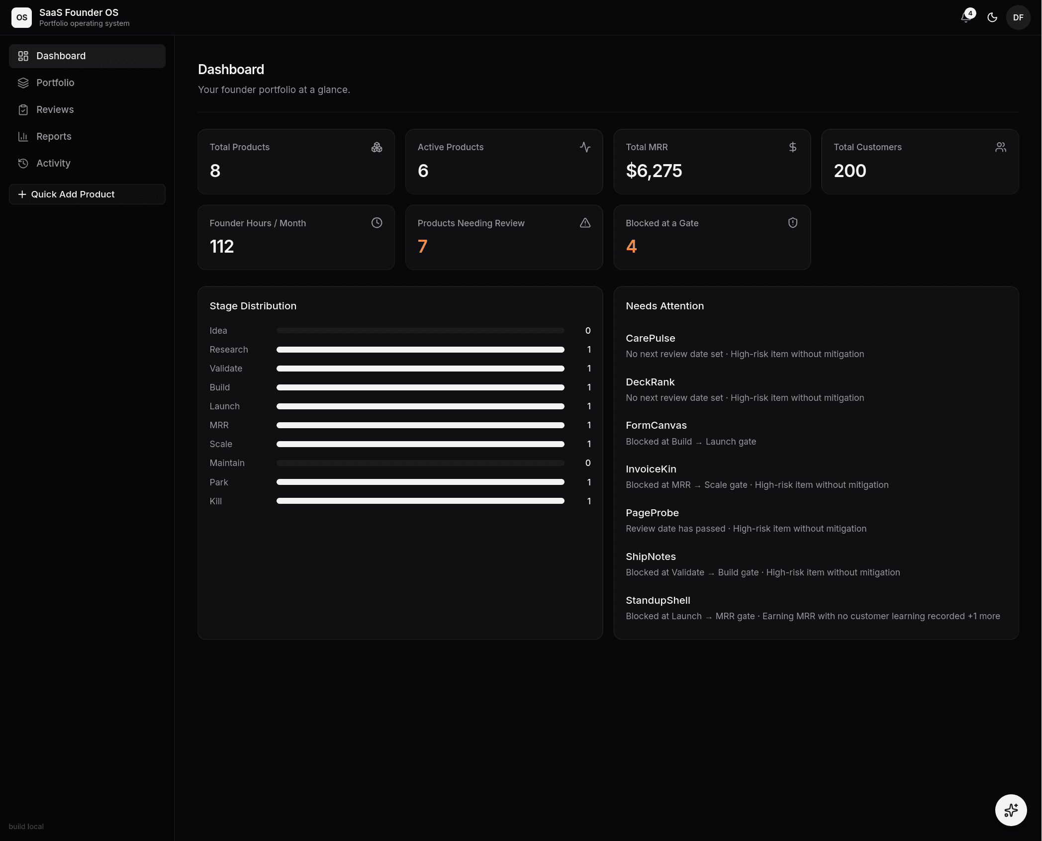 The cockpit: the MRR hero with the breakeven run-rate line, the KPI strip,
and the Needs Attention list.
The cockpit: the MRR hero with the breakeven run-rate line, the KPI strip,
and the Needs Attention list.
The numbers
- Portfolio MRR hero chart — the trend area at the top: daily MRR across feed-tracked products, with the headline numbers in the card's header bar: MRR and Customers (both update to the day you hover, defaulting to today's live totals), flanked by product and active-product counts. A dashed breakeven line marks the current monthly run-rate needed to net zero (infrastructure + founder time) — MRR is not profit until the area crosses it. Delivery days only — products without a feed don't fake history, and a quiet feed breaks the line instead of being bridged. With no feed history yet the header still shows today's totals and the chart area says so honestly.
- KPI strip — ARPU per month, founder-adjusted net (with founder time shown inline), products needing review, and products blocked at a gate. The strip deliberately carries no MRR/customers cards: those live in the hero header, and numbers appear in exactly one place.
- Product economics — the per-product table: stage, MRR, customers, ARPU, infrastructure, founder time at each product's own rate, net/mo, and MRR share, with the portfolio footer row. This is where you find which products are dragging the portfolio net down.
- Founder-adjusted net, by product — the same net numbers as bars: blue right of zero, red left of it. The cut-bait view — a product whose bar can't climb toward zero at its own founder-hours rate is a candidate to kill, and killing it lowers the portfolio breakeven.
- Stage distribution — every product on its stage, bars colored by the same palette as the stage badges. A healthy portfolio usually has more products on the left of the pipeline than the right; if everything is "BUILD", nothing is being validated.
- Concentration & sellability — how much of your MRR rides on your biggest product (investors read >50% as "this portfolio is really one asset"), plus how many products are scored, earning, and decided.
- Workspace snapshots — every dashboard load records the day's portfolio totals (non-demo) into the workspace history, which is what makes portfolio-wide trends keep compounding even beyond feed data.
Needs attention
Below the totals sits the Needs Attention list — the deterministic engine flagging the products where something is genuinely overdue (red dot = hard signal, amber = hygiene):
- a review date that has passed
- an incomplete opportunity scorecard (a product you've never honestly scored)
- a gate you could satisfy but haven't advanced
- a high, unmitigated risk on an active product
- a feed delivery failure on a live product
- MRR declined two feed points in a row — a revenue trend worth a look
- no feed metrics delivered in 7+ days — a live feed that went quiet
Treat the list as the agenda for your weekly session (see the weekly rhythm) and work top-down. Each item deep-links into the product where the fix lives.
The bell
The notification bell in the top bar carries the same signal outside the dashboard: review reminders, gate-ready alerts, and feed failures, deduplicated and markable-as-read in one click.